This post is also available in ITALIANO
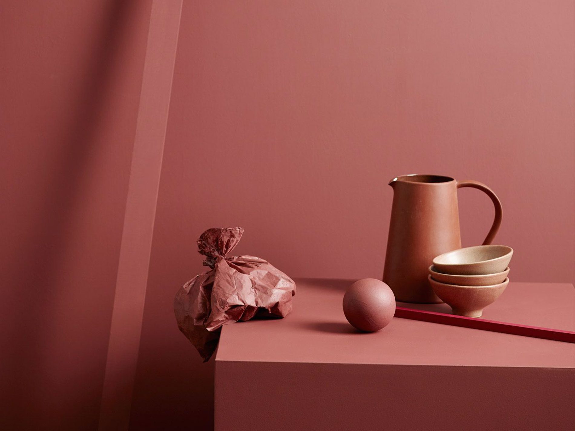
Terracotta: it’s a colour reminding of craftmanship, of sobriety and style. The age of pop colours and fluo is definetely finished, it is then necessary to go back to the nature. Terracotta is, in all its nuances from orange to slamon and brick red, an extremely dense and pasty shade, which helps to make your ambience warmer in few, simple touches.

via shakemyblog.fr
At IMM Colonia 2018 pink was surely te most seen colour. In that occasion I wrote about rosa Shim, with its calm and saturated colours, and among its numerous declinations there’s terracotta. Like the name suggests, terracotta suggests the colour of the wood, trying to establish a contact with nature and its atmosphere. So, it’s perfect for a place requiring concentration, like your studio.

With cocoa and hazel
Matching terracotta with cocoa or hazel colour gives a warm and welcoming touch to the place. Colours remind of the wood and the leather, two extremely concrete colours, which trasmit sensetions of coziness and protection, physical closeness. This palette is called “Heart Wood Home”, maybe because this match is one of the most similar to the ones of the cocoon.

via italianbark.com

With blue and turquoise
Blue and turquoise are colours of the palette called “The Inviting Home”: matched with terracotta, they instill feelngs of openess and sociality, perfect then for the living room, where the theme of the encounter has always been centeral. Blue and turquoise nuances are bounded to a system of meanings, regarding authentic relationships and an approach to life oriented to sincerity.

via sightunseen.com

With green and yellow
“Playful Home”: that’s the name of the palette, matching together lively colours like mustard and lichen green. Creativity and amusement show through from these nuances, giving a sense of lightness and life to places. “Playful home” activates feeling of amusement, perfect for places where creating new ideas!

via eclectictrends.com

With pink and orange
Intimacy, this is the sensation coming from the palette “Comforting Home”. A colours scale going from pink to orange, in order to give calm to people entering the domestic ambient. That’s how a bedroom in “comforting” style will turn into the perfect cocoon to put your mind at rest a find some peace.

via i.pinimg.com

via latazzinablu.com
Leave A Comment