


Your Christmas Planner: Staying Organised This Festive Season
This year we're looking to get ahead of the holiday chaos with our free Christmas planner that breaks down everything you'll need to be prepared for the festive season.
The beauty of shabby chic comes in all shapes and sizes. It’s an interior trend that galvanizes bringing the old and the new together in an orderly fashion; it’s also a trend that is quite thematic. To learn about and begin with the foundational elements of shabby chic, you’re in good steads to shape the style in a direction that suits you and your style.
Perhaps you lean into eclecticism and won’t take minimalism for an answer, or maybe you admire the elegance and charm of country cottages and aspire to recreate the scene of The Holiday, bringing out your inner Kate Winslet. I mean, who wouldn’t? With a theme in mind, your colour palette will be the icing sugar on top of a victorian sponge cake. Again, what’s not to love?
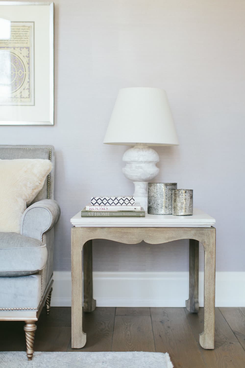
Shabby chic typically puts emphasis on the materials and fabrics, furniture and decor to truly bring the style to life. The attention to detail and comfortably worn ambience can too be applied to the walls; the use of soft hues, whites, and light pastel shades such as pale pink, powder blue, lavender, mint green, and beige are the shades many fall in love with when it comes to shabby chic. It’s a colour palette that’s playful and sings in harmony with the weathered wood, antique goods, and patterned fabrics placed throughout a home.
So, the only question now is: What colour shall we go for?
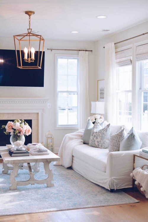
There is nothing quite like a freshly painted, clean white wall. If you’re looking to start from a blank slate, Feather Pillow is as close as you’ll get to an artist’s canvas. The colour enhances a room by allowing natural light to seep in and reflect off the walls, creating an illusion of spaciousness. As with many interior styles, white is the go-to because of its simplicity; putting the attention on the decor and furniture. Additionally, if you’re wanting to add a slight hue of colour, Rock Salt has a beautiful grey undertone.

If it’s a neutral backdrop that you’re after – a colour that sets the scene – Garden Grey and Soft Sourdough are two shades that bring the vintage and romantic glow often found within shabby chic. Neutral tones such as grey and cream are the ideal approach for when you’re looking to add a subtle dash of colour to a room without it being dominating or the focal point. I particularly love a neutral shade in a room with cream, gold, and wooden accents; when combined they bring an elegant look and feel into a space.

I touched on it briefly earlier, but what I love about shabby chic is its versatility. It makes it possible to experiment all the different elements that make up the interior trend; be it florals, mismatched tableware, and whitewashed furniture as well as try out some pastel colours that you may not have considered before. That may be because you didn’t know how to bring them into your home, or where the colours would best be placed but as you’ll see from the examples below; it almost doesn’t matter where you decide to use these colours, they look divine pretty much anywhere.
A brush of light pink and violet make a beautiful addition to a kitchen or living room. Opt for Floating Petal or Powdered Heather for a bleached-out effect that is neither too light to notice or too bright to take over a room. The shades are just the right hue and bring a stunning balance of softness into a room with several rustic elements.
To add an earthy look and feel into a room, a subtle shade of green works perfectly. Calming Chamomile is a subtle green with a pastel-ly (that’s a word, right?) appeal. Otherwise, if you looking for a stronger kick, try Fragrant Herb for an olive tone that brings an atmospheric feel into a space and looks gorgeous when it’s married up with black accents, linen fabrics, and wooden features.

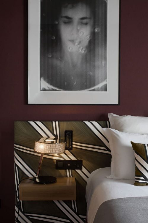
I would call this the royal blue simply because of how it feels inside a room, but that might confuse what colour I’m actually talking about. We’re not talking about the rich, deep blue – not in shabby chic. Here we’re talking about the sea-infused blue; a tone that’s light enough to wash away any preconceptions of it making a room feel cold. Especially when it’s combined with the floral accents and light fabrics of shabby chic, pastel blue tones such as Steel Parade and Restful Slumber add a gorgeous royal feel inside a room that seamlessly ties everything together.

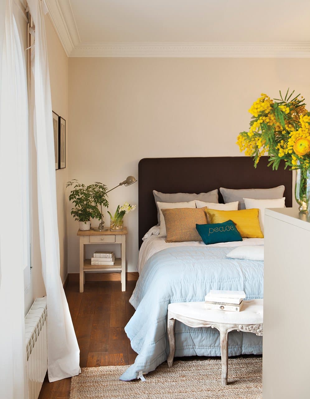
Influenced by french country cottages, a nod to yellow pastel tones such as Sandy Steps comes as no surprise. To create the perfect shabby chic look, it’s often better to stick with neutrals, whites, and pastels shades as anything darker begins to feel more rustic than chic. With that in mind, my suggestion on Golden Light comes with slight hesitation but as we can see when it’s combined with lighter, pastel tones it creates a charming ambience that works magically together.

Photo credits: 1. El Mueble 2.Leanne Ford 3. Kate Marker 4. El Mueble 5. Jacquelyn Clark 6. El Mueble

This year we're looking to get ahead of the holiday chaos with our free Christmas planner that breaks down everything you'll need to be prepared for the festive season.
Scouting out vintage classic pieces and antiques for your home has just become easier.
Quick and easy ways to bring elements of mid century modern aesthetics into your bathroom for a sleek and trendy look.