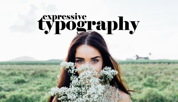
A lesson in expressive typography
Written by Dominic Ayre
Five years ago, I was asked to teach ‘Expressive Typography’, and I realized that everything I love about type and typography could be packaged into a curriculum.

I should go on record and say that I think Expressive Typography is an odd title. All typography is expressive by its mere nature, isn’t it? However, what this course allows me to do is talk about the classic work of Brockmann, the paintings of Basquiat and El Lissitzky, the cut and paste methods of Martin Venezky (a personal hero BTW), the cartoon doodling of Kevin Lyons, Fantastic Man magazine, Paula Scher’s work for the Public Theatre and the disciplines of deconstructivism and have it all make sense.

(Julia's note: Its worth having a look at the Kevin Lyons (above) video on cartoon doodling)
I have the educational responsibilities of the university where I taught, but the bandwidth in teaching ‘expressive’ is really wide.

So back to the question that sparked this piece: How do you teach Expressive Typography? Well, I’ll tell you it’s tough. Not because it’s constrictive, but because it’s just the opposite.

The majority of students that come to my class have gone through two years and three prerequisite classes before they end up with me. Their experience has been rooted in Swiss/international theory, so they have been taught rigorous typesetting fundamentals.
Then they walk into Expressive Typography (oh yeah, renamed this year as Experimental). Imagine eating only oatmeal (sorry Swiss type) for all your life and then one day going into the kitchen and a cruise ship breakfast buffet is laid out in front of you. Where do you start?
I find that a majority of students panic a little—not running around, sky-is-falling, panic but definitely uncomfortable. I add to their discomfort by creating briefs that are about interpretation. Yes, the project outline is quite simple, but I ask them to question me.
I ask them to push the boundaries and create something that they want as the end piece. Fundamentally, I teach Expressive against the grain of the classic client and designer construct, and I ask the students to leave that comfort zone and become more conceptual, dare I say, introspective.

What does this wank have to do with typography? A lot. In our day-to day we are asked to create work that is appropriate for our client’s projects. We are asked to think through and often imagine ourselves in the shoes of the audiences for which we are designing. We have to think externally and react internally.
What I try and do with Expressive Typography is get students to do just that. I ask them to think about themselves and interpret their experiences into typographic realizations while using me for checks and balances. I ask them to embrace their emotions, good and bad. I get them to open up to methods that we as practitioners are rarely called upon to implement.
Is this art then?............Sure.
I teach this form of typography to help students embrace an identity. I teach in a way that allows students to show their thoughts, weird and the wonderful - to the world, using the concrete formation of language.

The work that we as designers create daily is rooted in storytelling. It doesn’t matter if it is a construction company’s website, a visual identity for a retail store or an app to encourage exercise in children. We are expected to build a level of emotion that will create a connection between our client and their audience. To be able to do that we need to understand that audience, and to do that we need to be wider emotional thinkers.

Expressive Typography opens up the intellectual and the emotional sides of a designer and allows her to see many perspectives.
designedgecanada.com/DominicAyre
kystudio.ca/expressive-typography
Dominic Ayre graduated from The Bournemouth & Poole College in the UK and has worked in Toronto as a designer for more than 20 years. Working through small and medium sized studios, he has been with Hambly & Woolley since 2000 where he holds the position of Creative Director. Currently on faculty at OCAD University
Design Director | Adjunct Professor at DAAP University of Cincinnati
7yTypography is so emotional for me, its generates the same anxiety and excitement as picking a color from the Pantone library except much much more important. Selecting the right font establishes the foundation of you brand. So many times I've lost sleep over a design project because I could not find the right font that expresses the true essence of the brand I was building. But on the flip side you feel such an overwhelming sense of satisfaction when you find that perfect type that really set the tone.
Executive Director at Samina Farm Products.
8yNice article for non graphic designers as well.
Virtual Reality Engineer & Technical Artist
8yEverything goes back to story telling. One of the reasons I pursued Graphic Design was because of that. Thank you.
Art Director/Creative Consultant at Barbara Humphries Graphics
8yIt is impossible to take type for granted in these thought provoking designs.