On the day KitchenAid's Passion Red stand mixer color dropped, America lost its damn mind. Women passive aggressively tagged their husbands in Facebook posts. Shopping carts—virtual and IRL—were filled. KitchenAid's feed of tagged Instagrams became a veritable shrine to the fiery shade.
BUY NOW Passion Red 5-Quart Tilt-Head Stand Mixer, kitchenaid.com
Meanwhile, at KitchenAid's Benton Harbor, MI, headquarters, there wasn't a hint of pandemonium. In fact, the team that had created the color was nearly unfazed. They were too busy developing a new one you won't even see for half a decade. "We work on these things for so many years before they hit the market, so we’re kind of like, ‘Oh, yeah, right—that’s launching now'," Jessica McConnell laughs.
She's KitchenAid's senior manager of color, material, and finish—aka, one of the people responsible for the hysteria that ensues every time a new shade launches. After all, the colors are half the reason people obsess over KitchenAids. Why five stand mixers are sold every minute. Why people treat their mixer like a family member, literally hugging it in photos.
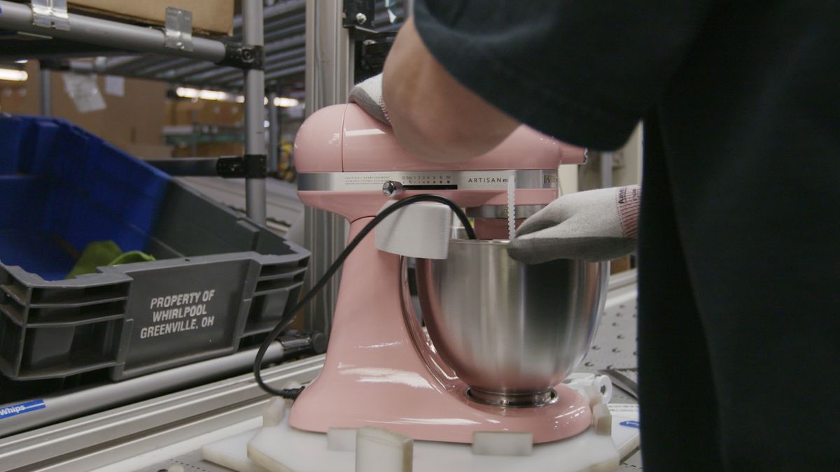
They're not just mixers. They're an obsession, and it's been that way since the appliance launched in 1919. (Scroll down to watch the modern mixer get made at KitchenAid's Greenville, OH, factory.)
Before its official release a century ago, a KitchenAid executive showed the mixer—then the company’s only product—to his wife. She exclaimed, "I don’t care what you call it; it’s the best kitchen aid I’ve ever had." And just like that, KitchenAid got its name.
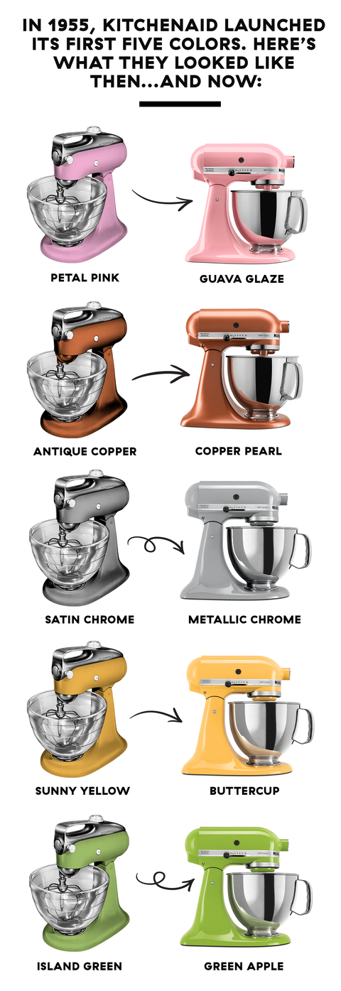
The original mixer was a hulking, white-and-silver, industrial-looking beast. It took two decades to nail down the now-iconic shape and another two to realize the importance of color. In 1955, the first hues were introduced: Petal Pink, Island Green, Sunny Yellow, Satin Chrome, and Antique Copper. That date is one of only ten "milestones" KitchenAid calls out on its site's century-long timeline. See? Colors = a BFD.
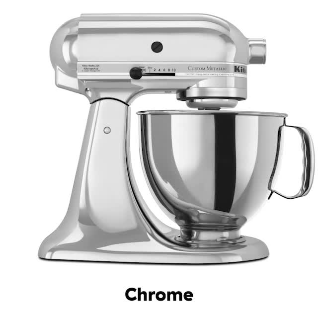
The original palette doesn't exist anymore, at least not in its exact midcentury glory. You wouldn't want anything to do with it anyway, Jessica explains: "You can’t just use the colors from the '50s," she says. "Changing the slightest amount of yellow or green in a color will take you to a decade or an era, and sometimes not in a good way. We’re talking minutia here but it can make all the difference in the world." You're better off with their 20th century counterparts: Guava Glaze, Green Apple, Buttercup, Metallic Chrome, and Copper Pearl.
Right now, Jessica and her team are working on developing 2021’s Color of the Year. Last year was the first year KitchenAid even named an official Color of the Year, but the plan is to release a designated one every year, adding to an arsenal of hues that's already 84 strong. But though the program is new, it’s already making waves in the industry. Pantone’s 2019 Color of the Year—Living Coral—is a veritable knock-off KitchenAid’s 2018 shade, Bird of Paradise.
KitchenAid's design team hasn't released this year's Color of the Year yet. The shade is meant to be an indication of trends to come...and the brand's been a little focused on celebrating its past. One hundredth anniversaries only come around, you know, once.
Now, of course, the company is so much more than one mixer. "That one sentence alone about how we got our name has been carried throughout as we continue to create new products," says Nikki Lockett, KitchenAid’s U.S. marketing leader for small appliances. Dishwashers came along in 1949; ovens, stovetops, and refrigerators were added to the portfolio in 1986; and in 1993, more small appliances were introduced—blenders, hand mixers, food processors.
But after a century of innovation, the stand mixer still reigns supreme. It's earned shelf placement in stores in more than 115 countries. The PDA-opposed set doesn't hug their KitchenAid for a photo opp; they literally tattoo a picture of it on their bicep or calf. (Type "KitchenAid tattoo" into Pinterest or Instagram, and you'll fall down a fascinating hole you might not be able to climb out of.)
"We make something that people want for Christmas then cry when they open. It’s incredibly rewarding, and the fact that we get to open people’s eyes to the thought process and how much we really care is great," Jessica says.
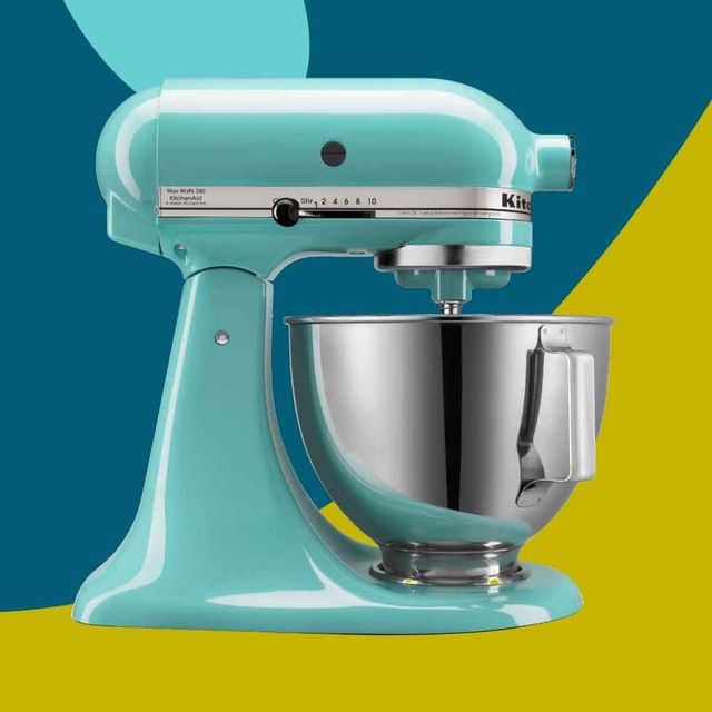
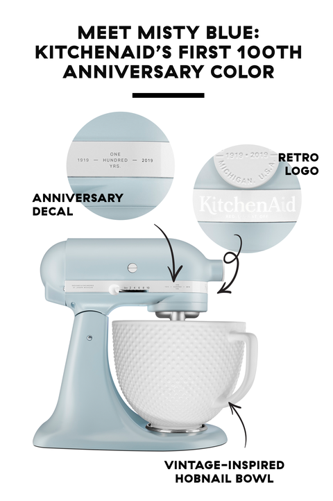
Misty Blue was a pivotal moment for KitchenAid's design team. "Reading comments on Instagram and our website and seeing how people just love it so much—that’s really cool." The new color was the first release for KitchenAid’s 100th anniversary. (The Queen of Hearts collection featuring Passion Red came out five months later.) It was tied to a story that celebrated the brand’s heritage and riffed on those original shades KitchenAid produced in 1955.
BUY NOW Misty Blue 5-Quart Tilt-Head Stand Mixer; kitchenaid.com
There's a science to drumming up a frenzy the way Misty Blue did. "I think my design team did probably nine or 10 iterations of the color. We spent months tweaking it, making it the best version of itself." Jessica says. Sometimes one of the team members will sneak an unreleased color into a store and put it on shelves, just to see what it looks like in that environment. "It has to look good in a store, in a photograph, on the countertop, in the daylight, and at night. It has to last a lifetime."
When Delish wrote about the launch of Misty Blue, we called the color "more calming than 10 deep breaths." And that’s exactly what Jessica wants to evoke when introducing a new color—a feeling you can put your finger on. She explains, "We’re creating an emotional blanket for someone. Those are the kinds of things that will resonate. You think of the millennial pink wave—that was a generational need and a response to certain emotions that were happening."
Every year, a research team looks into social and cultural trends then translates those into aesthetic themes. KitchenAid’s global team takes the themes and visualizes what colors make sense within them. The ones that make it through the next pass are scrutinized: Do they resemble an existing color? Are they too polarizing? Is there any region that’ll object to them? "That usually gets us down to about three color options," Jessica says. "A small team looks at pros and cons, and we decide how to move forward."
When you look back over the decades of color launches, you’ll notice patterns. There were the years of electric, poppy brights. Then came the 2000s, when silver and stainless steel were king. "We still have the aftermath of that in the market," Jessica laughs. KitchenAid created exclusive silver options, one barely different from the next, for different retail partners. "They wanted something no one else had—that’s why we still have so many silvers, but we’re paring them down as we see that trend waning." They were overtaken by pastels, which are now fading in favor of relaxing, desaturated, desert hues. "People fall in love, and they kind of build a bond right away. You’ll have really nice success if you hit the right tone," Jessica adds.
At any given time, the Greenville factory looks like a rainbow exploded in it. Different assembly lines with many machines spit out various parts for the stand mixers—lock plates, gear cases, attachment hubs. They’re smoothed and hung from hooks that swing into a chamber to get a powder coat of color. Inspections are made along the way, and any parts that don’t pass the test (maybe there's a bubble in the powder coat or a defect in the finish) get sanded down and painted again. The parts are put together and go through a barrage of tweaks and tests: The motor’s got to run. The plug has to correspond to the proper country to which the mixer is shipping. Then they’re boxed, and off they go.
You can tour the facility in the off season, but five minutes down the street is the KitchenAid Experience—or “mecca,” as one Yelper called it. There, you'll find a small museum with vintage KitchenAid models, ads, and artifacts. There are cooking demonstrations and classes. And there’s a retail level, with the most complete collection of KitchenAid products you’ll find anywhere: a ROYGBIV line-up of stand and hand mixers, food processors and blenders, gadgets that you didn’t even know the brand made.
By the time you finally make it to Greenville to see, there might be a new color on display—maybe even an entirely new appliance. Neither Nikki nor Jessica will reveal exactly what’s to come for KitchenAid in 2019. All they’ll confirm is that the centennial celebrations are far from over. We’ll take it.
