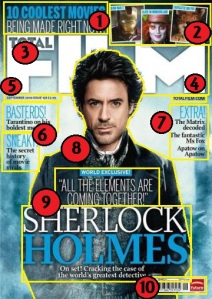
‘Total Film’ magazine, featuring Sherlock Holmes on the front cover as the main focus of attention…
1-’10 Coolest Movies Being Made Right Now!’
Explanation & Analysis…
This aspect of the magazine cover is a puff as well as anchorage text. It’s a puff because it explains to the audiences some of the films they can expect to read about inside (getting their interest in buying the magazine) and this also explains the 3 pictures beside the text. The use of having the first piece of the text ’10 coolest movies’ in bold blue letters helps capture the reader’s attention and the use of an exclamation mark also makes it appear exciting and exclusive. Positioned in the top left hand corner, this keeps out-of-the-way of the covers main feature but still gives it enough space to look important and eye-catching.
2- 3 Photos that link to the first piece of text ‘Iron Man 2’, ‘Alice in Wonderland’ and ‘Fantastic Mr Fox’
Explanation & Analysis…
This is pretty much a part of the previous puff, as it links to some of these 10 films currently being made and gives the reader three examples. Thus this gives the audience a taste of what kind of films they can expect to read about inside and they will then be more intrigued to read about what others are included in this section. The three pictures are all located in the right hand corner, again positioning them away from the cover’s main feature yet signifying it’s importance to the reader just as well. They all also have a direct mode of address (as all of the characters are looking at the reader/consumer), which helps catch the reader’s attention further. I think it’s also useful that all three pictures contain one iconic character from each film (and because all of the films are adaptations of comics/books, like ‘Alice in Wonderland’ and ‘Fantastic Mr Fox’) because this way they will be easily recognized by most audiences and will therefore capture their attention easier.
3- Name of the magazine ‘Total Film’
Explanation &Analysis…
Although the main image of Robert Downey jr/Sherlock Holmes is superimposed over the top of the text, the name of the magazine (also called the masthead) still stands out well. The text is large and white, and the fact it is on a light blue to dark blue background makes sure the audience does not miss it and shows it clearly is important. The fact the name of the magazine is positioned at the top of the cover also signifies it’s importance to the reader/consumer. I think the name of the magazine is important, but because it is so iconic, can easily get away with having an image superimposed over the top of it.
4- Website ‘TotalFilm.com’
Explanation & Analysis…
This is a pug, located on the right hand side, below the name of the magazine. Although it is in very small text and does not stand out as much as the magazine’s other features, the website does serve a vital purpose: to widen the fan base of the magazine (as some may not be able to afford the magazine itself).
5- Date & price
Explanation & Analysis…
Well, in a similar manner to the website, the date and price is also very small compared to every other aspect of the magazine cover, and is positioned in the left hand corner (below the masthead/name of magazine, making it a pug aswell) but still remains essential.
6-‘Basterds! Tarantino on his boldest movie yet’ & ‘Sneaky! The secret history of movie virals’
Explanation & Analysis…
Well these aspects are both puffs- as they equally get audiences wanting to read the mag/buy it through certain language techniques and references amongst other things. Such as the fact each puff has an opening keyword that instantly captures the audience’s attention (which is indicated by the fact the texts are bigger and are blue rather than black) thus this hooks them and gets them interested and reading the rest, and therefore are more likely to buy the magazine itself. The fact that exclamation marks are used in each puff shows how it is made out to be exciting- and will naturally get the audience’s attention. Furthermore, the use of language in each puff is persuasive- as it gets audiences interested through giving only limited hints and sneak peeks at what’s inside and dropping in names such as ‘Tarantino’ (clearly established director Quentin Tarantino) which is very likely to get certain reader’s interested in at least reading the magazine, let alone buying it. Although it is pushed to the left hand side and is quite small, these puffs are still quite near the centre of the magazine and thus this ensures they are not missed.
7- ‘Extra! The Matrix decoded, The fantastic Ms Fox, Apatow on Apatow’
Explanation & Analysis…
As before, the puff uses one word (written in one big blue word) to catch the reader’s eye and hook them onto reading the rest of the puff and hopefully then the articles inside. Again, exclamation marks hype up the puff and make it appear exciting to the reader. Positioned opposite to the other puffs, this helps links them together somewhat, and shows they are both aspects which share pretty much the same qualities and purposes. The puffs use short and snappy sentences and language techniques to cleverly get audiences interested and summarise what they can expect to read inside without giving them too much/giving too much away/cluttering the front cover with words. Also, using keywords again, such as referencing to iconic films such as ‘The Matrix’ is pretty much definite to get audiences interested in buying/reading the magazine itself.
8- Main Image- Robert Downey Jr as Sherlock Holmes
Explanation & Analysis…
The main focus of the magazine cover has to be the image of Robert Downey jr as the character of Sherlock Holmes. This is mostly due to the image taking up the most room on the cover and being positioned pretty much directly in the centre (even with text superimposed over him as well as being superimposed other texts at the same time)- so he is therefore more likely to capture the audience’s attention than any other aspect on the cover, signifying it’s importance. The main image also uses a direct mode of address (looking straight at the reader) to further catch the reader’s attention and increase the chances of them buying it. As well as this, if we analyse the actual character, we can see aspects of him actually connote certain things to the audience which may make them gain further interest in the magazine itself. For example, the costume he is wearing is obviously from an earlier time period, suggesting the film he is from maybe somewhat historic or will take place in an earlier time period. His ruffled hair and stubble, as well as the fact he has his hands in his pockets may also suggest to readers his character is somewhat mischievous or rebellious, and they will be interested to see if this claim is true and if so, why and how.
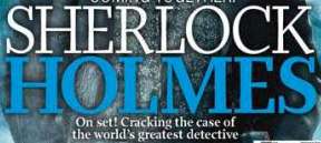
9- Anchorage text- ‘Sherlock Holmes’, ‘On set! Cracking the case of the world’s greatest detective’ & ‘World Exclusive!’,”All the elements are coming together!”
Explanation & Analysis…
Well all of this is anchorage text, as it links to and explains the main image and focus of the magazine cover. The colour code is clear and therefore the blue and white text- all helps link it to image and reinforce it’s purpose on the cover. It also professionally fits in with the overall colour codes of the magazine cover itself. The fact these pieces of text are all superimposed over the image itself signifies it’s importance to reader (so it cannot be missed) and furthermore links it to the image itself. ‘Sherlock Holmes’ being the biggest and boldest piece of text (and almost directly in the centre of the magazine cover), this reinforces the text’s importance to the reader as it is the name of film as well as the character on the cover (indicating to the reader that this is the protagonist of the film). ‘On set! Cracking the case…’ the smaller writing underneath the name of the film, explains the image in a little more detail to audiences to get them interested. Here language techniques are also used, such as ‘world’s greatest’ which further persuades the audiences to buy the magazine and read the article and is ti make it appear too good to miss. Positioned a little bit lower than the other pieces of anchorage text, the ‘World Exclusive!’ piece still hold importance, which is reinforced by how it is still positioned in the centre of the magazine cover. ‘Exclusive’ makes the main feature appear big and new, and furthermore helps sell the magazine. Also, using a quote (from probably someone working on the film or even the actor who is in the main image) gets audiences interested further as they wonder who has said this about the film and why, and thus will want to read article inside/buy the magazine itself.
10- Barcode
Explanation & Analysis…
This is simple to explain really. The barcode is small because although it’s vital it’s not vital to help sell the magazine to consumers. This is reinforced by how it is pretty much pushed out-of-the-way and positioned in the bottom right hand corner so as not to take up too much room or take away from more important features.


