A committed dancer wins the lead role in a production of Tchaikovsky’s “Swan Lake” only to find herself struggling to maintain her sanity.
Noah Orent – IMDb
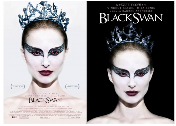
Natalie Portman plays the protagonist of the film Nina Sayers; Portman is recognised as an A-List actress and is known for roles in the film ‘V for Vendetta’, The Thor film series and Star Wars Trilogy, she won an Oscar for Best Performance by an actress in a leading role. Having such a well-known actress like Natalie Portman as the main focus of the poster would induce more interest for people to watch the film through star appeal. The cover image is from the film as well, in this shot, Natalie Portman receives a standing ovation for her performance as the swan queen; this shot poses some significance as it showcases the finale of the film in which Nina embodies both swan queen and black swan, the composition of this shot draws attention to the Portman’s eyes: by using heavy eye make-up as well as red eyes to contrast the predominantly black and white colour scheme of the poster. Her eyes are extremely intriguing in this poster; upon first glance, it would appear as though Natalie Portman is making direct eye-contact with the camera when the picture was shot, but when looking deeper it is more evident that her eyeline is actually past the lens and makes the expression seem more sinister than seductive and giving across a more eerie look. With the film being the production work of one of the sister companies of a Big Six film company (Fox Searchlight Pictures): it is typical for the film poster to features the film had received, in this case from Venice and Toronto in 2010. By using two posters they allow the film to highlight it’s plot further: using the same main image but inverting colours of all things around the headshot, the posters are able to highlight the plot of the film as well as emphasise the unity of the swan queen and black swan characters in Portman’s character. The posters use a jagged and serif font to illustrate the way the character ( Black Swan ) upholds herself and reinforces the concept of the poster looking unnerving and unnatural.
The minimalistic look of the posters are extremely effective when trying to bring about attention to them: the first poster brings attention to Portman’s eyes as they contrast the opposing colours of the poster, making the viewer question what her intentions are, while the second highlights Portman herself and makes the reader think about what she’s going through. As a pair of posters they are very powerful in bringing about a sense of balance; the posters are done in opposite colours (black on white and white on black) but by using the same image they make Natalie Portman the constant subject and emphasise how everything is changing around her, highlighting her loss of sanity.
